Fuser Apps are here 🚀
Fuser Apps are here. Free generations for the next month 💫
Let's GoBrand identity & systems
Develop the photography, typography and graphic language that give your brand its character. Then put them to work in packaging concepts, campaign layouts and digital experiences—with the important details still yours to edit.
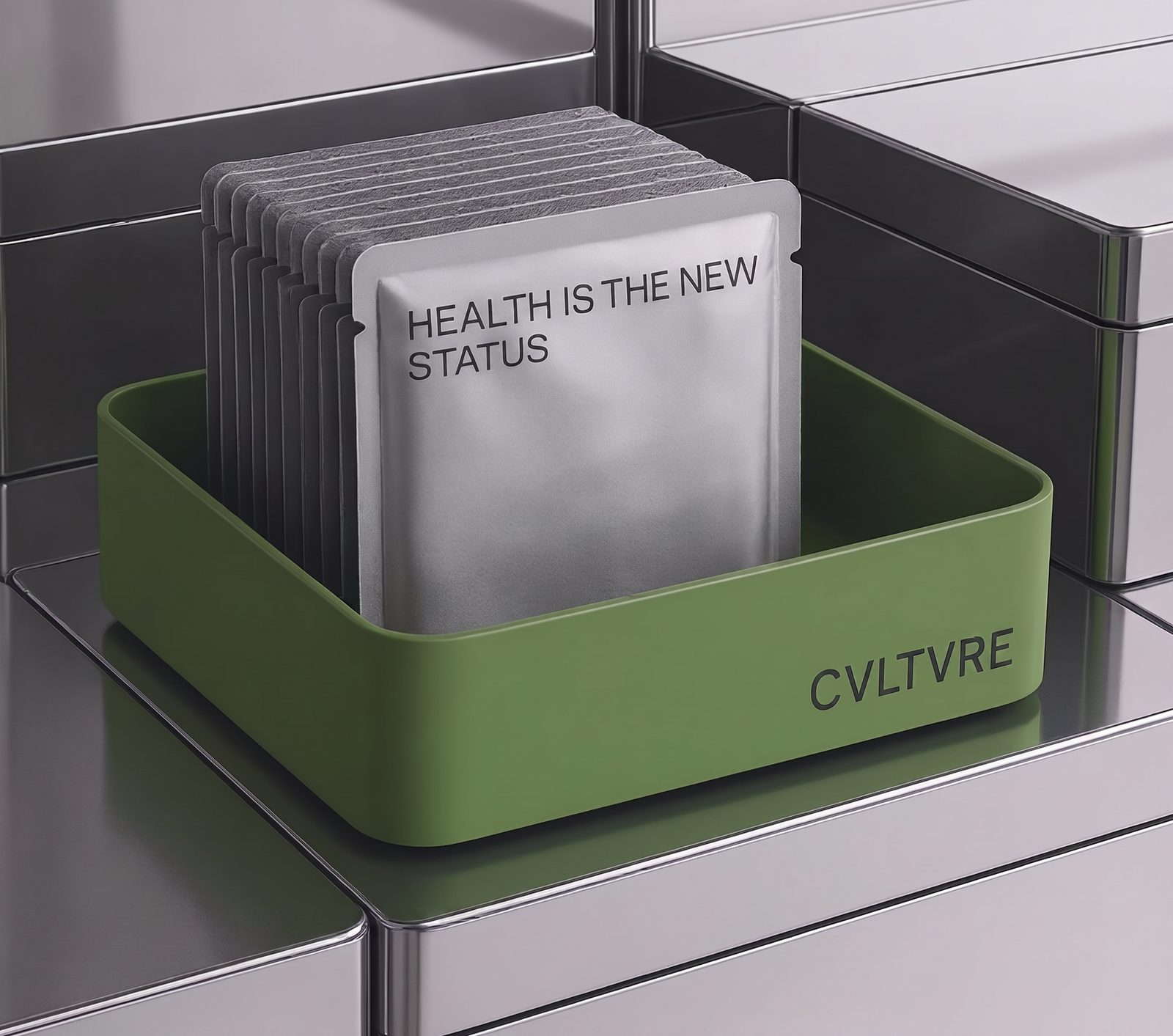
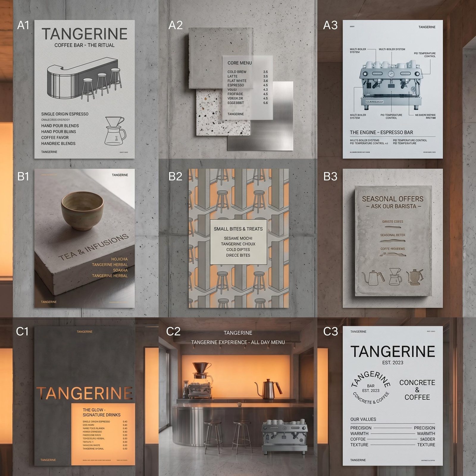
Explore image treatments, materials and visual motifs around the brand’s personality. Compare how each direction feels across more than one image. A strong identity needs to hold up as a body of work, not just a striking hero shot.
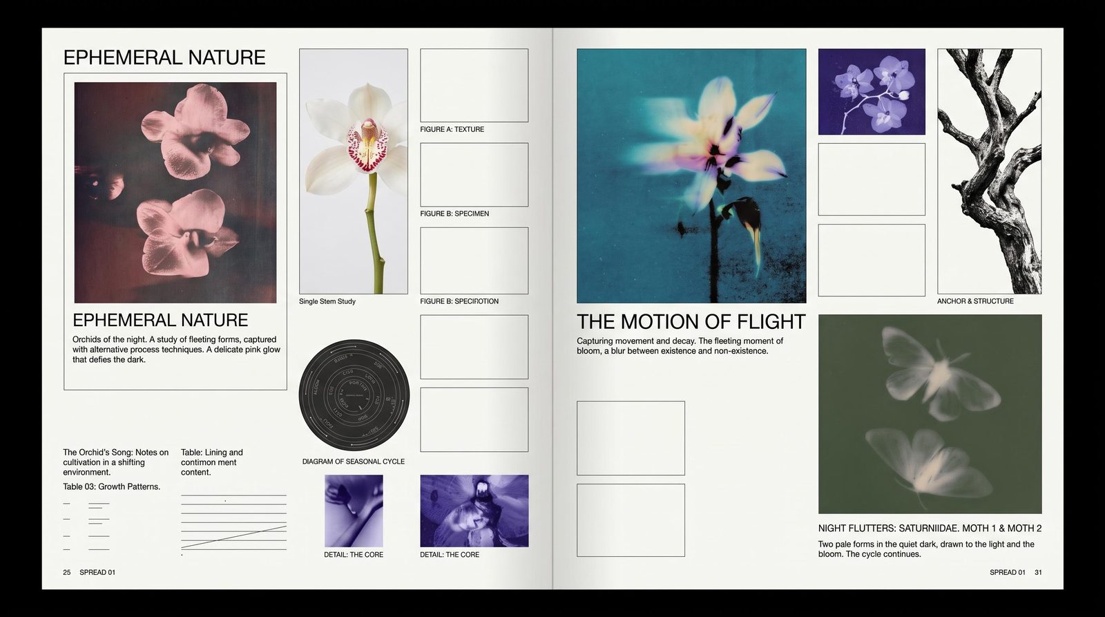
Set real type, place the original logo and fine-tune the layout in Compositor. Work with font families, variable-font controls and individual letter spacing. Change a tagline without asking AI to redraw the mark or reinterpret the rest of the design.
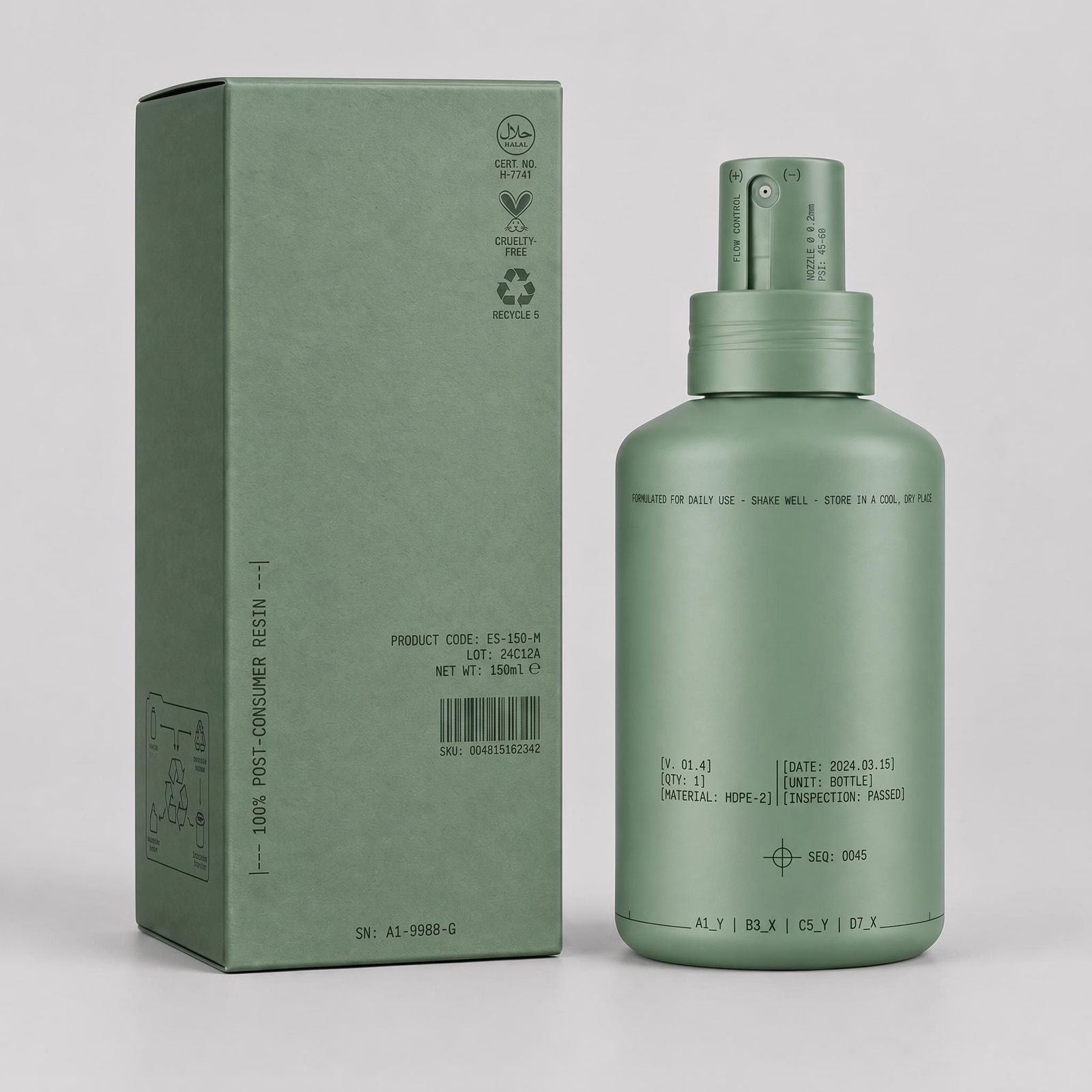
Build a campaign layout, a packaging presentation or a live brand microsite. Use Creative Code for animated patterns and interactive graphics. Seeing the identity across static, moving and interactive work helps you decide what belongs in the system.
From the first visual territory to the applications that make the brand recognizable.
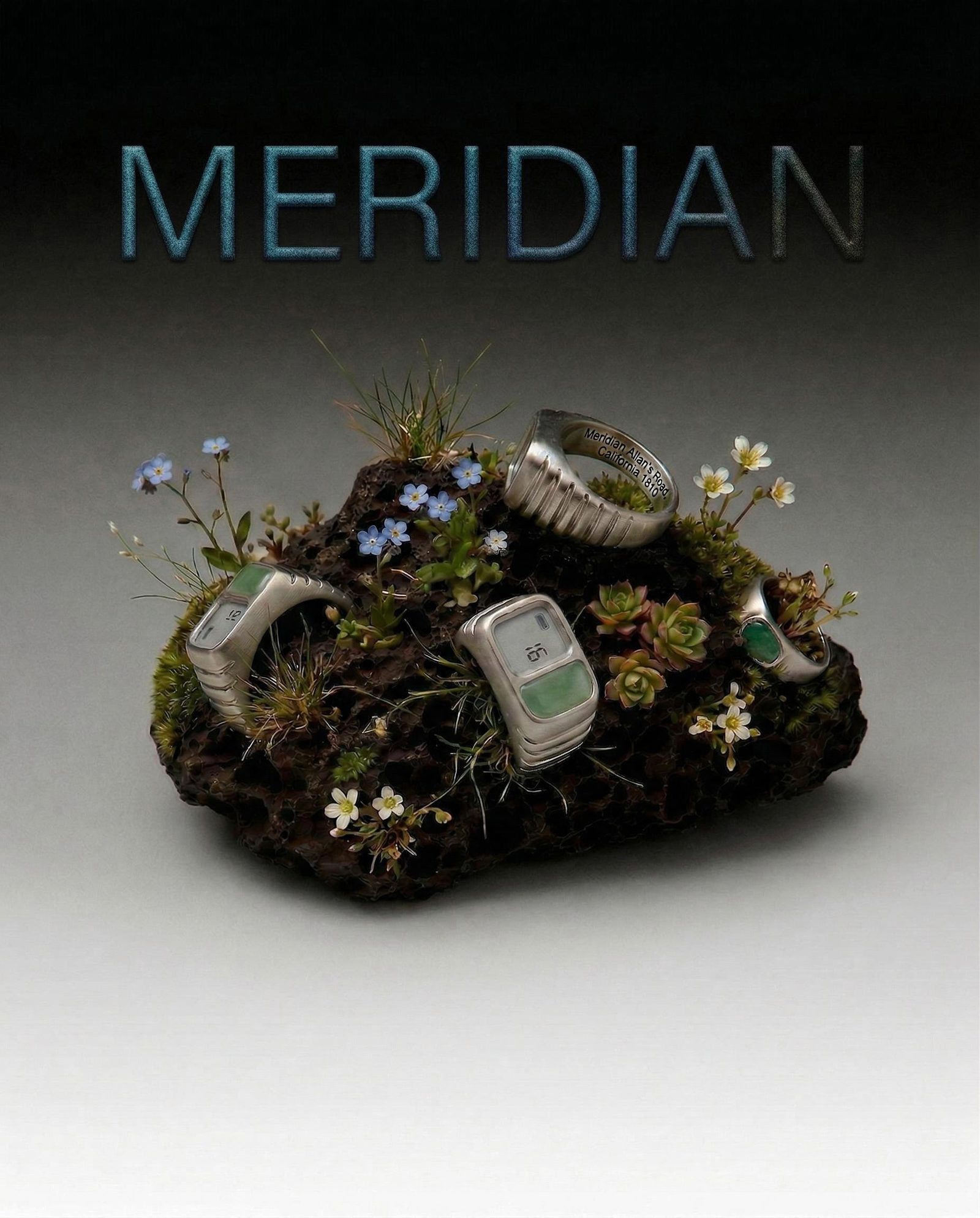
Image language
Develop a recognizable approach to lighting, subjects, texture and composition.
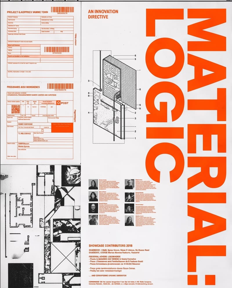
Typography and layouts
Set a deliberate hierarchy with editable type, brand marks and graphic elements.
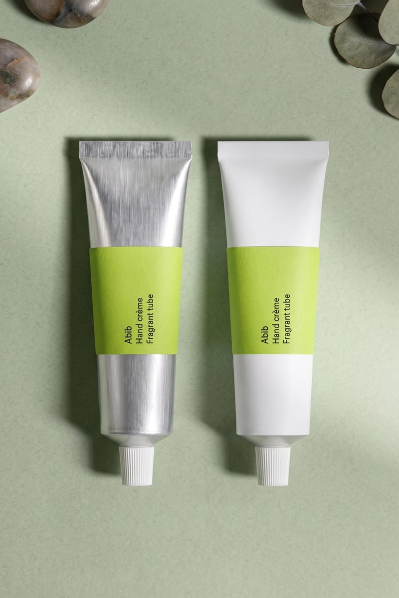
Packaging and campaign concepts
Show how the identity works on products, promotional imagery and launch materials.
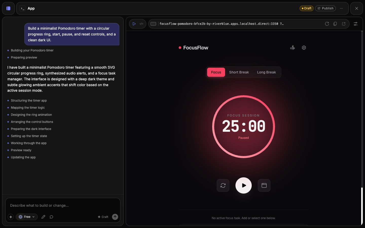
Motion and digital expression
Extend the look into animated graphics, interactive sketches and live websites.
Yes. Use original brand assets as separate layers in Compositor. Choose built-in or Google Fonts, or upload a font you have the right to use. Uploaded custom fonts stay local to your device, so collaborators need the matching font file on theirs.
Yes. Develop distinct image treatments, color relationships and graphic ideas, then apply the strongest routes to a few real touchpoints. A campaign layout, packaging concept and web page reveal more than a single hero image. Compare how each route behaves before choosing the visual language to develop.
Recipes package a working set of connected steps into a reusable tool with chosen inputs and outputs. Your team can start with the same references and process, then review each result against the brand’s standards.
Yes. Set the tagline as a text layer in Compositor and keep the artwork separate. Edit the wording, font, spacing or placement directly. Your logo can remain an original asset too, so a copy revision does not ask an image generator to reinterpret the identity.
Yes. Use Creative Code to develop animated patterns and interactive graphics, and Apps to build a running brand website. Bring existing imagery and marks into the work as assets. You can judge whether the identity feels recognizable across static, moving and interactive applications.
Yes. Compositor supports nested compositions. A shared logo lockup or graphic frame can feed several layouts, and changes to that upstream composition appear in its connected uses. Update the shared element instead of rebuilding it in each layout.
Keep the references and creative decisions that define the look in a reusable workflow: the image treatment, subject direction and composition cues. Expose the parts that should change as Recipe inputs. Review new outputs against the brand direction, then finish exact typography and marks in Compositor.
Develop a visual direction, then see how it holds up on the work your audience will encounter.