One click, whole workflow
Recipes are here. Package a whole workflow and run it in one click
Explore recipesOne click, whole workflow
Recipes are here. Package a whole workflow and run it in one click
Explore recipesbyReve AI
Posters, packaging and signage where every headline lands crisp, correctly spelled and exactly where you placed it
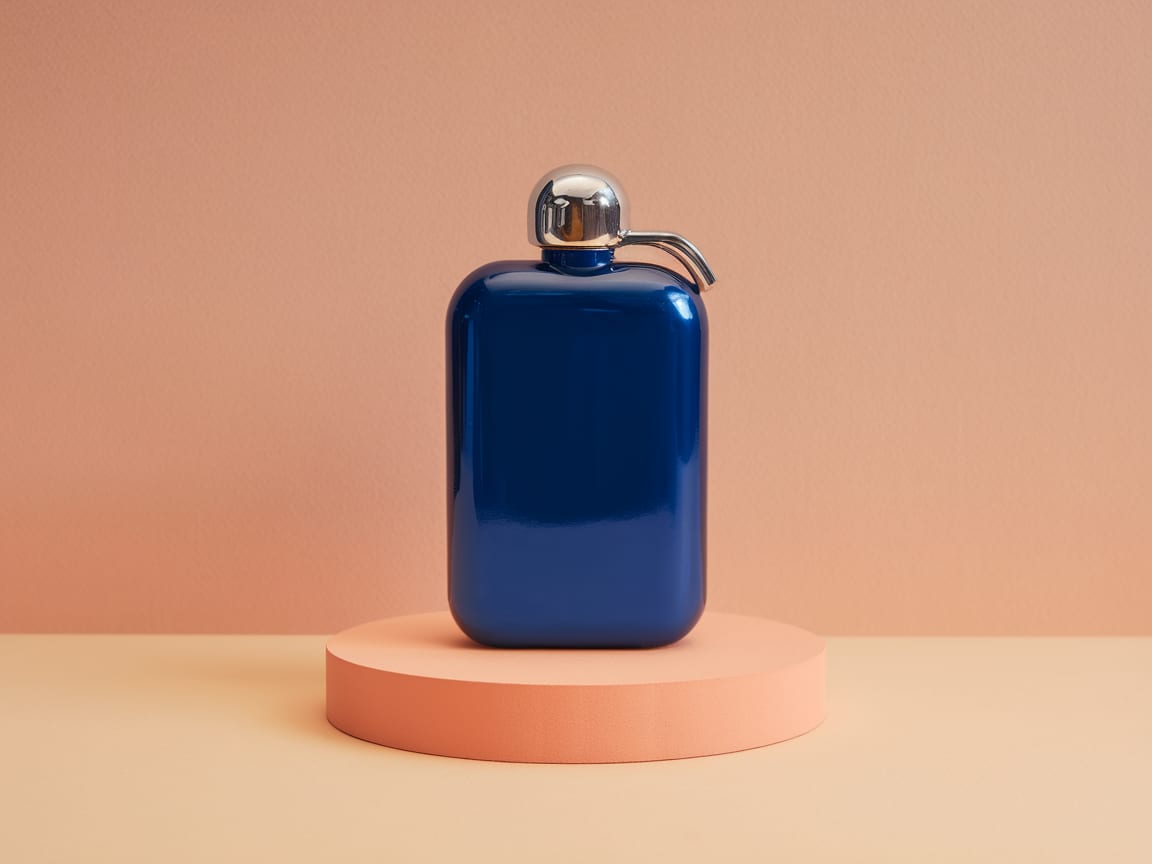
Write the image like a layout brief, set a tier and a frame, and refine with plain instructions. The same node generates from text, edits one image or remixes several.
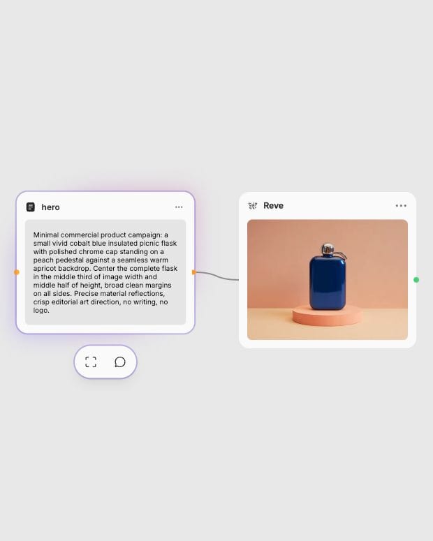
Write a layout brief
Describe the subject, where it sits and any literal text in quotes, then attach up to eight reference images if you have them.
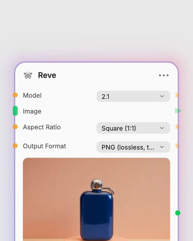
Pick a tier and a frame
Choose 2.1 for final typography or Original for cheap drafts, then set the aspect ratio and file format.
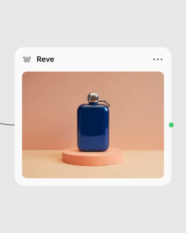
Generate, then edit in place
Get a clean, hierarchy-aware composition, then change one element with a plain-language instruction.
Reve plans composition, hierarchy and text placement before it renders, which is why its strengths are readable type, spatial logic and edits that leave the rest alone.
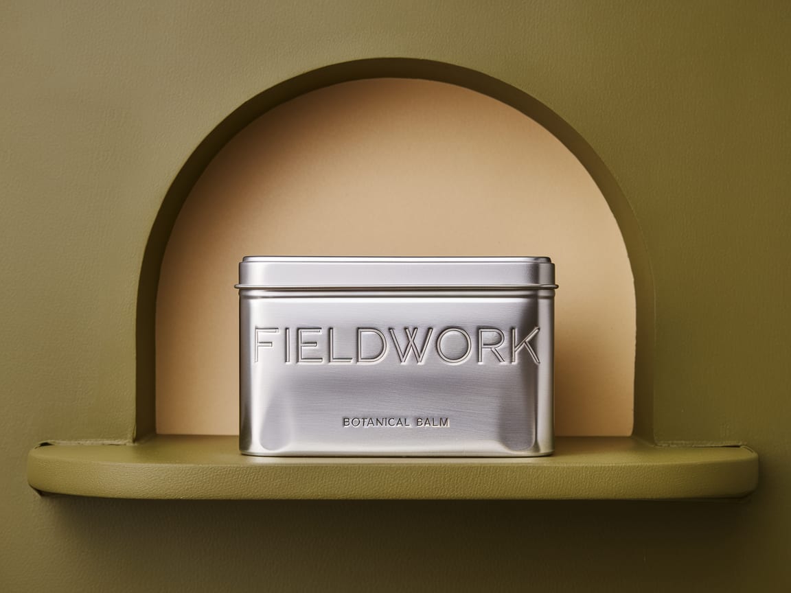
Crisp, correctly spelled type
A language-model planner places headlines, labels and signs before rendering, so packaging and posters carry legible copy. Use 2.1 text-to-image when typography and multilingual text matter most.
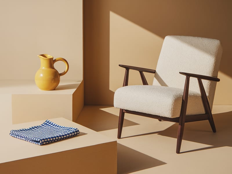
Remix up to eight references
Give each reference one job — product, person, location, style — and name it by index in the prompt. Remix on 2.1 keeps each reference's identity more reliably than the Original tier.
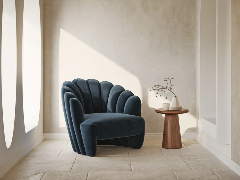
One-instruction edits
Swap a garment, recolor a background or rewrite a sign's copy, and say 'keep everything else the same' so untouched regions hold steady. Edit takes a single source image and is available on both tiers.
Layouts from 4:1 to 1:4
From panoramic 4:1 banners to tall 1:4 signage, plus Auto. Describe the layout to match the frame and the composition holds.
Posters, fashion frames, packaging, film stills and interiors, all with clean focal hierarchy, polished light and tidy spatial relationships.
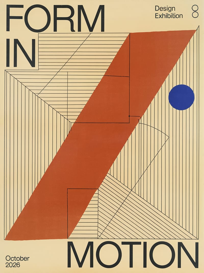
Constructivist typographic exhibition poster
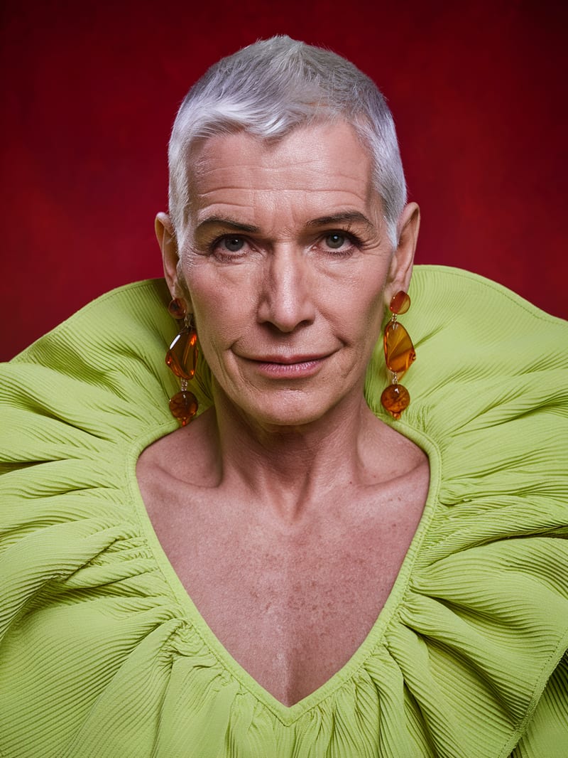
Editorial fashion portrait with saturated color tension
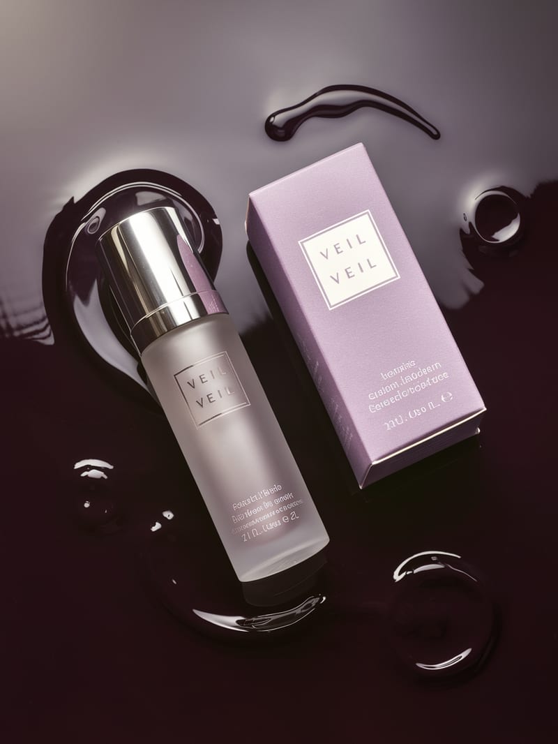
Minimalist luxury cosmetic packaging hero
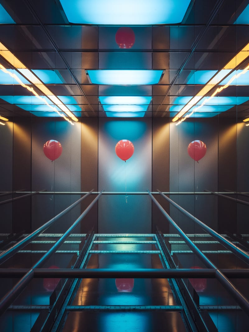
Cinematic music-video visual frame
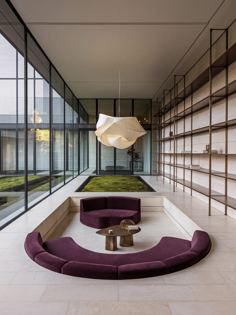
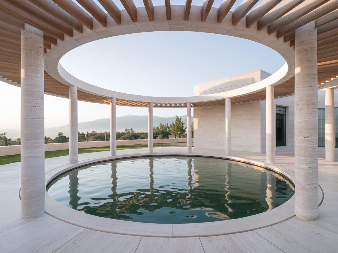
Modernist interior spatial study
Designers, packaging teams and art directors reach for it when an image has to be laid out as well as rendered, and when copy on the page has to read correctly.
Reve 2.1 is the higher-fidelity tier and the default; the Original is the cheaper, older one. 2.1 is the better choice for final typography, multilingual text and layout precision. Original costs several times less, but has weaker typography and fidelity, so use it to explore composition and copy, then finish on 2.1.
Use 2.1 for final edits and remixes, and the Original for inexpensive tests. Edit takes one source image and works well for swapping an element or changing copy on a sign. Remix takes 2 to 8 references and depends on you stating each reference's role. The Original remix is less reliable at keeping each reference's identity separate.
Halfmoon is the name under which Reve AI, a Palo Alto lab, first previewed this model in early 2025. It is the same model family that is now released as Reve, so you are in the right place.
Up to 8. With no image it generates from text, with one image it edits by instruction, and with two to eight images it remixes. For remix, give each image one job and name it in the prompt.
It struggles with real-person or celebrity likenesses, where moderation is strict, and with loose painterly or abstract exploration, where results can look over-clean. It has no seed or step control for reproducibility, and it won't guarantee transparent-background cutouts. Very dense text blocks can still misspell, and 2.1 is a poor fit for bulk throwaway drafts.
Posters, packaging and signage where every headline lands crisp, correctly spelled and exactly where you placed it