One click, whole workflow
Recipes are here. Package a whole workflow and run it in one click
Explore recipesOne click, whole workflow
Recipes are here. Package a whole workflow and run it in one click
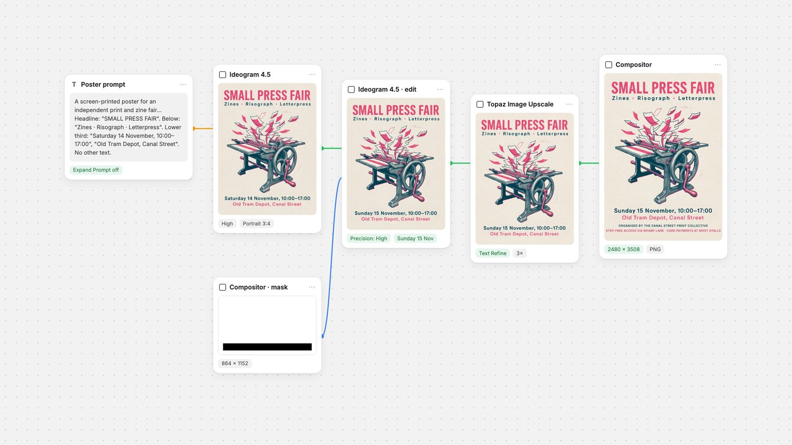
Explore recipesA tested workflow for posters with text: Ideogram 4.5 for the design and headline, a masked Ideogram 4.5 edit for copy changes, Topaz for resolution and Fuser’s Compositor for an exact A4 canvas, real text layers and PNG export. Every step was run, and every character counted.
All guides · Ideogram 4.5 in Fuser · Topaz upscaler in Fuser
Quick answer: Generate the poster with Ideogram 4.5 and quote every line of copy in the prompt. In our eight generations it spelled all of the requested text correctly. The only miss was one dash. Text accuracy is no longer the hard part. Size and late changes are. On its Portrait 3:4 setting, Fuser's Ideogram 4.5 node returns 864 × 1152 px, and it never left the empty band we asked for. So the workflow in Fuser has four steps. Draft at Medium quality and pick a layout. Change copy with a masked Ideogram 4.5 edit, which left everything above the text block pixel-identical in our test. Upscale 3× with Topaz. Then set the exact canvas size and the brand lines as real text in the Compositor, and save a PNG. Below are the prompts, settings and counted results for each step.
Three limits shape this workflow.
Size. In Fuser, the Ideogram 4.5 node offers Square HD, Square, Portrait 3:4, Portrait 9:16, Landscape 4:3 and Landscape 16:9. Portrait 3:4 returns 864 × 1152 px, and every one of our generations came back at exactly that size. An A4 page (210 × 297 mm, ISO 216) at 300 pixels per inch is 2480 × 3508 px. The aspect ratio is different too: 3:4 is wider than A4.
Copy changes. Dates move and venues change. Re-rolling a whole poster for a one-line change gives you a new layout, so you need a way to change one line and leave the rest alone.
Brand lines. Organiser names, sponsor lines and access notes have to be exact every time, in your own font. Lines like these work better as real text than as pixels the model drew.
Ideogram 4.5 handles the art, the headline and the copy changes. Ideogram calls it "the most precise edit model" and says it reduces drift, "preserving details across multi-turn edits" (Ideogram 4.5). Fuser's Compositor handles size and brand lines: canvases from 1 to 4095 px on each side, text layers and PNG export.
This is the prompt we used for every base test:
A screen-printed poster for an independent print and zine fair. Two-colour risograph style in fluorescent pink and deep teal on off-white paper, with a large illustration of a hand-cranked printing press throwing sheets of paper into the air. Headline at the top in a heavy condensed sans-serif: "SMALL PRESS FAIR". Directly below it, smaller: "Zines · Risograph · Letterpress". In the lower third, in medium text: "Saturday 14 November, 10:00–17:00". Under that: "Old Tram Depot, Canal Street". Leave the bottom 15% of the poster as plain off-white paper with no text or illustration. No other text.
What each part does:
Every line of copy is in straight quotes, one quoted string per line. The model gets the exact characters, and you can count them afterwards.
Position and size go outside the quotes: "at the top", "directly below it, smaller", "in the lower third".
"No other text" closes the copy deck. None of our eight generations added a word, badge or logo we did not ask for.
Expand Prompt off. It is on by default in the node, and it expands your prompt before generation. We turned it off so the prompt was the only thing changing between tests. A single paired run with it on (same prompt, same seed) also spelled all 95 characters correctly and added no text. It did produce a different layout, though, with the headline split over two lines.
A fixed seed makes a run repeatable. We used 101, 202 and 303.
For generation, Fuser's node offers Low, Medium (default) and High quality. Ideogram's API reference says higher quality "takes longer and costs more" (Ideogram API). In Fuser, High costs nearly four times as much as Medium. Drafting at Medium is the cheap way to find a layout.
We ran eight generations, each once. Six used Medium quality with Expand Prompt off. After that came the High run in step 3 and the Expand Prompt check above. To find the limit, two of the Medium tests added more copy than the base prompt. One added two lines of fine print ("Free entry · Over 60 exhibitors · Workshops at 11:00, 13:00 and 15:00" and an access line). The other was a workshop programme of eight lines with times and names such as "Kwame Asante-Boateng" and "Saoirse Ni Bhriain".
Results, counting characters with spaces excluded:
Base prompt, seeds 101, 202 and 303: 95/95, 95/95 and 94/95. The single miss was punctuation. Seed 303 set "10:00—17:00" with an em dash where we had typed an en dash.
Base prompt plus two lines of fine print, seeds 101 and 202: 204/204 both times. Seed 101 had a layout flaw, though: it set "SMALL PRESS" above the subtitle and a widely spaced "FAIR" below it, so the headline no longer reads in one go.
Eight-line programme: 400/400, every name and time correct. The only flaw was layout: the gap after the first programme line was larger than the others.
High quality (step 3) and Expand Prompt on: 95/95 each.
That makes 1,282 of 1,283 requested characters correct across the eight runs. What the model did not do was follow the layout instruction. We asked for the bottom 15% to stay blank. Measured from the last line of ink to the bottom edge, the four base-prompt runs with Expand Prompt off left between about 4% and 7%. The run with it on left about 12%. If you need a clear band for logos or sponsor text, don't count on the generator to leave it. You can make the space in the Compositor (step 6).
Pick the draft you like and run it again at High quality for the final art. Be aware that High is a new image, not the Medium draft rendered better. With the same prompt and seed, our High run at seed 101 came back with a pink headline and a different press illustration from the Medium run. The text was still 95/95. If the Medium layout is the one you want, keep it. If you want High quality, choose from High runs.
We took the High run (seed 101) forward as the final poster.
Connect the poster to the Image input of a second Ideogram 4.5 node and the node switches to editing. Connect a mask to its Mask input, set Edit Precision to High and leave Image Size on Auto. The node will not run a masked or High-precision edit at any other size.
Ideogram's rules for the mask (precise edit API):
"Black marks the area to edit and white the area to keep."
The mask must have the same width and height as the image and contain both black and white.
The output matches the input's width and height, and "pixels the edit did not meaningfully change are copied exactly."
Make the mask in a Compositor node. Select Canvas in the Layers panel and set Width to 864 and Height to 1152, the poster's size. Draw a rectangle (R) over the whole canvas with a white Fill. Then draw a black rectangle over the line you want to change. Connect the Compositor's output to the edit node's Mask input, and Fuser renders the scene to an image when the node runs. We made our test masks outside Fuser to the same spec. If you do the same, save the mask as an ordinary 8-bit PNG. Our first two masked requests used a 1-bit black-and-white PNG, and both were rejected with an image-load error. The same masks saved as 8-bit PNGs worked.
Then describe the change:
Change the date line to read "Sunday 15 November, 10:00–17:00". Keep the same font, size, colour and position. Change nothing else.
Result, one run at Medium edit quality: 28/28 characters correct. The new line kept the typeface, weight and colour and was re-centred for its new length. We compared the files pixel by pixel. Every pixel above the text block, including the headline and the whole illustration, was identical to the source. All changes fell in a band around the two text lines. The venue line just under the mask was redrawn very faintly, with no visible difference. We also ran the same edit with no mask, keeping Edit Precision High. It gave an equally correct line and the same untouched area above the text block. For a clear, line-level instruction, the mask mattered less than we expected. It is still the safer choice when the same word appears more than once.
Where it failed: punctuation. We tried to fix seed 303's em dash. First we used a small mask over the dash and asked for an en dash. The output was pixel-identical to the input, with nothing changed at all. Then we masked the whole time range and asked for it to be rewritten with a short dash. The model redrew the numbers and the dash came back long again. That is two attempts and two failures. A one-glyph punctuation fix is easier to make in the Compositor. Cover the line with a rectangle in the paper colour and type it as a text layer.
864 × 1152 is too small for print at A4 size. Connect the edited poster to a Topaz Image Upscale node and set Mode to Precision and Scale Factor to 3, for a 2592 × 3456 output. The node's Scale Factor goes from 1 to 4. We ran two of its Precision Model options on the same image, once each.
Text Refine: clean letter edges and every character intact. On a blank patch of paper, the grain was slightly smoother than in the source.
Standard V2: the same letters, but noticeably stronger paper grain. We measured more variation on the same blank patch than in the source.
Both kept all the text correct, so choose by texture. We used Text Refine. A 3× upscale of this poster cost about half as much as one Medium generation. For other upscalers, see the best AI upscalers.
Connect the upscaled image to a Compositor node's Layer 1 input, then click Edit to open the editor.
Set the exact size. Select Canvas in the Layers panel. Under Dimensions, enter Width 2480 and Height 3508. Make sure Constrain aspect ratio is off, because the ratio changes. The Anchor grid controls where existing content sits when the canvas is resized. Each side can be anywhere from 1 to 4095 px. A3 at 300 ppi (3508 × 4961) is over that limit, so for A3, export at a lower resolution or ask your printer how they scale.
Place the art. Select the image layer. In Transform, set Width 2480 and Height 3307, which keeps its 3:4 shape at the canvas width. Use Align Left and Align Top. A4 is taller than 3:4, so this leaves a 201 px band at the bottom. That is the space for brand lines that the generator would not leave. Fill it with a rectangle in the paper colour.
Add the brand lines as text. Press T for the Text tool and type each line. In Typography, pick the Font or upload your own (.ttf, .otf, .woff or .woff2), then set Size, Tracking, Alignment, Line Height and Color. These lines are now exact characters at full resolution. Changing them later means editing a text layer, not generating again.
Fix anything the model can't. Our em dash would be a paper-coloured rectangle and a one-line text layer.
The same layers also work at other sizes. Change the canvas dimensions and reposition the layers for a social placement instead of generating again.
Click Save Asset. With no video layers, the Compositor renders the canvas at its full scene resolution, 2480 × 3508 here, and saves it as a PNG to your assets. If the scene contains video, Save Asset offers Image (PNG) or Video (MP4) instead.
In relative terms, the final poster took one High generation, one Medium edit and one 3× upscale. Together that is about what five Medium drafts cost. An edit costs the same as a generation at the same quality setting. That makes a one-line change cheaper than a High re-roll, and it doesn't touch the layout.
Quote every line of copy and end the prompt with "No other text".
Turn Expand Prompt off and fix the seed when you are comparing drafts.
Draft at Medium, and choose the final from High runs.
Proofread punctuation: dashes, quotes and separators. It was the only miss in 1,283 characters.
Change copy with a masked edit at Edit Precision High and Image Size Auto, with the mask at the same size as the poster.
Don't ask the generator for empty space. Make it on the canvas.
Upscale before the Compositor, then set exact pixels, real text layers and a PNG.
For prompt detail on this model, see the Ideogram 4.5 prompt guide. For a same-prompt comparison, see Ideogram 4.5 vs GPT Image, and for the wider field, the best AI models for text in images. For more multi-step graphs like this one, read how to chain AI models.
Node settings from Fuser, results from our own runs.
| Step | Node and settings | What we saw |
|---|---|---|
| Generate | ||
| Drafts | Ideogram 4.5 · Medium · Portrait 3:4 · Expand Prompt off | 864 × 1152; 6 drafts, one dash wrong, one split headline |
| Final art | Ideogram 4.5 · High · same prompt | New layout with the same seed; 95/95 |
| Reserved space | "Leave the bottom 15% blank" | Not followed: about 4% to 12% left |
| Fix | ||
| Copy change | Ideogram 4.5 edit · Mask · Edit Precision High · Image Size Auto | 28/28; everything above the text pixel-identical |
| Punctuation | Same, mask over the dash | Failed twice; set it as text instead |
| Finish | ||
| Resolution | Topaz · Precision · Text Refine · 3× | 2592 × 3456, all text intact |
| Exact size and brand text | Compositor · Canvas 2480 × 3508 · text layers | A4 at 300 ppi; max 4095 px a side |
| Export | Save Asset | PNG at full canvas size |
With Ideogram 4.5, mostly yes. In our eight generations, it got 1,282 of 1,283 requested characters right, including an eight-line programme with names such as "Kwame Asante-Boateng". The one miss was an em dash where we asked for an en dash. Quote every line of copy in the prompt and proofread punctuation.
Not in Fuser. Its Portrait 3:4 output is 864 × 1152 px, and A4 at 300 ppi is 2480 × 3508 px. Upscale the poster 3× with Topaz, then set the exact canvas size in Fuser's Compositor, which allows up to 4095 px on each side.
Connect the poster to an Ideogram 4.5 node, add a mask the same size as the image (black over the text to change, white elsewhere), set Edit Precision to High and Image Size to Auto, and describe the change. In our test, the date changed correctly and every pixel above the text block stayed identical.
In our runs, a 1-bit black-and-white mask PNG was rejected with an image-load error. The same mask saved as a normal 8-bit PNG worked. The mask must also match the source image's width and height exactly.
Add it afterwards. Text layers in Fuser's Compositor are exact characters in your chosen or uploaded font, at full resolution, and changing one is an edit, not a new generation. Use the generator for the art and the headline.
Medium was enough for spelling. All seven of our Medium generations spelled every word correctly. Use it to find a layout, then choose your final from High runs, since High costs nearly four times as much and the same seed gives a different image.
Run Ideogram 4.5, edit copy with a mask, upscale, and set exact sizes and real text in the Compositor.